Tuesday, 20 October 2009

Evaluation And Reflection

At first the thought of creating my own face in realistic detail within 3ds Max was a very daunting task. Firstly because I had never undertaken a project like this before, that required a lot of time and high attention to detail. I found it especially difficult in the beginning, although I feel confident and competent working within 3ds Max, I had never really modeled an organic or complicated physical object such as a face and head before.

The tutorial videos provided vital help and taught me effective techniques for modeling the face. The methods I learnt can easily be applied to many other objects in the future.
The whole process was quite straight forward for me, I had some issues with the UVW Mapping and texturing later on in the process, but this was fixed and came out just fine on my second attempt.
The UVW Mapping process in my opinion was the most difficult, because I didn't really know if what I was doing was going to work until the end when the textures had been applied. This was why when the first attempt didn't work correctly it was very frustrating.

I had some small issues with topology but nothing serious that hinders the final design in any way. However if I had to do the same project again I believe I could easily draw a more efficient topology and have a much better final design.

Areas such as the eyes, ears and the lips were the most difficult areas to model. Even more so due to the provided tutorial videos not covering the detail on the eyes and lips. The lips are the area of my model which I am most displeased as I know I could develop them further and create a much more realistic model. Perhaps I will have another go at a later date.

If I had more time dedicated to the model I believe I could add some shoulders and shirt to give a more realistic texture to the character. I'd of liked to have spent more time extending the length of the animation and animating my characters facial expressions a bit more but I think I could easily spend as much time on the animation as I did modeling.

Having gone through the process of creating the head and face I feel as if I could re do the whole project and take half the amount of time. The methods used are simple and effective once you understand how the whole thing comes together. It is a good technique of modeling to learn not only because it is generally quite simple but because you can create really detailed models. This style of modeling could easily be implemented to all sorts of different objects, not exclusive to head and body objects.

Since the beginning of the project I have found myself looking at characters from animated movies and computer games trying to imagine how I would go about creating the faces myself.
I have enjoyed the project and I'm sure that I will be practising again in the future.
Monday, 19 October 2009

Animation

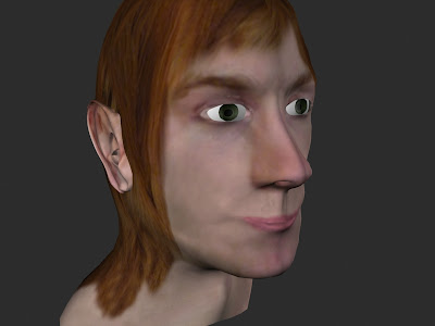
With the model now finished I wanted to spend the remaining time left making the face animate a bit. Whilst I spent too much time pulling faces in my mirror, it gave me the information I needed to pull the verticies on the face map to portray a realistic emotion.
Within the editable poly's sub selection mode I played around, tweaking the points to see how well I could manipulate the face whilst still keeping it realistic.

By selecting a group of points in a certain area of the face and pulling them in a direction I found I could get some pretty good results. I wanted my characters face to go from a smile to a scowl and back again. First I had to disable the Unwrap UVW modifiers to have access to the editable poly selections. I turned on Auto Key at the bottom to activate the time line for animating then selected the points on the cheek to pull them up.


I then selected the points around the eye and drew them closer together, making the eye smaller. I also pulled a lot of the points around the forehead and just under the eye closer together as well.


To try and make the face realistic when moving I moved a lot of points on the face, because as in real life everything on the face is connected and it all moves together. So this is what I was trying to simulate. The images below show the smile and scowl faces.


As a final touch I also added a small amount of unrealistic but slightly comical facial movements such as rolling of eyes and a short flapping of the ears. The eyes involved picking a point on the time line, setting a key, then moving ten frames on, rotating the eye ball to a particular direction. 3Ds Max automatically animates the movements in between. The ear was also very simple, I just pulled out points and rotated them slightly to give a flapping effect.

Before rendering I added two spot lights to the scene to light up the face. I turned shadows off to avoid any kind of odd shadows appearing on the face.


Under Rendering and Environment I chose a slightly lighter black colour for the background rather than jet black background.
Below is the final render for the animation. I set the resolution to 1280 by 800, a higher resolution than the standard 800 by 600 and is ideal for wide screen laptop monitors. I also rendered the animation as a .MOV file, ideal for users running Windows as well as Macintosh.
I created a second render at a lower resolution which was more suited to uploading on to Blogger.

Sunday, 18 October 2009

Bump And Specular Mapping

Now that the modeling and texturing process was effectively finished, the next step was to add bump and specular mapping to the face textures to make it appear much more realistic.
To start with I opened the render map up inside Photoshop, created a new layer underneath the render map layer and filled the image in a mid grey colour. I also copied my render map layer and kept it hidden, just in case the bump mapping went wrong.

Now under Image Adjustments, I chose Desaturate to turn the render map black and white. Then again under Image Adjustments I chose Levels to make the white bits whiter and the dark bits darker.


Then under Filter, Other and select High Pass. This option disregards most of the image and leaves only the highlights and pieces of the shadow that stand out. I set the value to 2.


I saved the image and imported it back into 3ds Max and applied it under the Bump setting in the material browser for the face texture. Next I wanted to create some depth in the texture by adding noise to the bump map material. I did this by blending/mixing the bump map with a noise map. I also changed the mix amount to 68.3, as I found this a good balance between the bump and the noise maps.


Back in Photoshop I added a couple extra details to the bump map to add some subtle details to the map within 3ds Max. 3ds Max picks up the lighter colours within the map as being areas that will rise slightly, and the dark areas are left as background. So with a soft small brush size I used a white colour and painted small lines around the mouth, nose and eye areas where there are creases and lines in the skin, then used the blur tool to soften the lines more.


Now back in 3ds Max I can see where the lines have been raised up slightly to give subtle detail around the eyes, nose and mouth.


The bump map is now finished and I can now begin on the specular map.
Inside Photoshop with the bump map image, I copied the bump layer, renamed it to Specular, then selected Levels from the Image Adjustments selection.
I moved the black arrow about halfway to the right giving the image a dark picture, then dragged the white arrow over about halfway to the left which lightens up the picture. Moving the grey arrow across so it was next to the white arrow gave me the dark picture back whilst still keeping white highlights in the picture.


I created a new layer and selected a white soft brush in a low opacity to paint in highlights on the face and ears.


To finish off the specular map I applied a Gaussian Blur (value set to 10) under the filter options to blur the highlights into a more organic flow which should make the map appear more life like within 3ds Max. I also added a 'Texturizer' filter (scaling set to 79% relief set to 4)on top of the blur to give the highlights a more grainy skin like texture.


In 3ds Max I loaded the specular map into the face material and tweaked the specular and glossiness levels. Below is the finished model, complete with texture, bump and specular mapping.


Now to animate the face.

Detail On The Eye

The final part of the face I needed to tweak and add more detail to was the eye area.
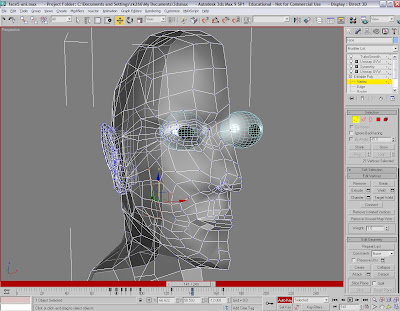
I wanted to add an object to be the eye ball. I made a sphere and turned it 90 degrees on its X axis. Using the scale tool I manipulated the object to better fit the eye socket, then under the vertex selection tool I moved points around the eye to better fit the sphere.

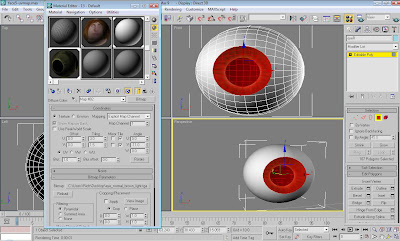
The next part would be to add the texture to make the eye look right. I copied the eye object, scaled it down and then moved it so it was slightly inside the bigger sphere.


I used the boolean tool to cut out the smaller object, leaving an indentation inside the bigger sphere. With the materials box open I changed the colour of the sphere to a dark white.


I turned the sphere into an editable poly and selected the polygons that make up the indentation area. This would be where I will apply the texture of a pupil.
I downloaded a basic eye texture from Google, and imported it into Photoshop. Using the Hue/Saturation tool under Image Adjustments, I could turn the colour from brown to a dark green.


I then applied the image to the eye.


Under the materials menu I played around with the gloss and specular levels on the sphere object and the eye texture. This gave the eye a bit of a realistic shine.


To make sure I got the same result on the other eye I used the symmetry option to copy the sphere and get it into the right position on the other side of the face.


Wednesday, 14 October 2009

Creating And Applying The Textures

With the UV map of the face and head exported from 3ds Max, I imported it into Photoshop where I could start applying the texture.
I created a new layer and called it 'guide' this is where the lines that make up the face are going to be. I set my foreground colour to a bright blue and filled the layer. Now back on the original layer I selected everything (Ctrl + A) then on to the blue guide layer, I selected 'quick mask mode' from the left hand side, I then pasted the original layer onto this layer.


When I click off quick mask mode the guide layer now has all the white lines from the map selected. To give the selection more thickness I went to select, at the top, and then down to the modify panel, then selected border. This gives everything selected a more thick result.

With the map lines still selected, I applied a layer mask which preserves what I have selected and hiding the rest. Then I right clicked on the layer and applied the layer mask to the layer. Making the layer mask final.


The next part is to start applying the colour and texture to the face.
I kept the guide layer at the top so I always saw the lines as guidance. Then created new layers below it to start adding the skin textures. I opened up my high resolution photos that I took in the beginning, and using the lasso tool I cut pieces out and copied them onto the UV map render, building up the face as I went. The warp option within free transform was a handy tool for moving the skin around.


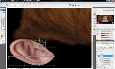
To texture the ear I used the same method as above, using the lasso tool and copied pieces of my ear on top of the UVW map. Making sure any empty black spaces were covered.


Below is the image of all the hair and skin placed over the map, ready to be imported back into 3ds Max. To make the whole image fit together I needed to cover up all the joints and lines from the different pieces of the face which were copied. This was done mostly with the clone stamp tool, by Alt clicking on a colour or area which I want to use, then painting that area over the lines and joints, making the whole image look much more fluid and realistic.
The clone stamp tool was a great help with creating and editing the hair around the head as well, as I could take different shades of colour from the hair and paint them in wherever I needed, it also allowed me to style the hair. This aspect was quite important because as you can see below my head is mostly hair.


Now to load up 3ds Max. The first time I textured the map and imported into Photoshop I ran into some problems with getting the texture to show correctly within 3ds Max. So with this being my second attempt on this section I spent more time and detail into getting it right.
Below is the first attempt.


This was what it looked like when rendered.


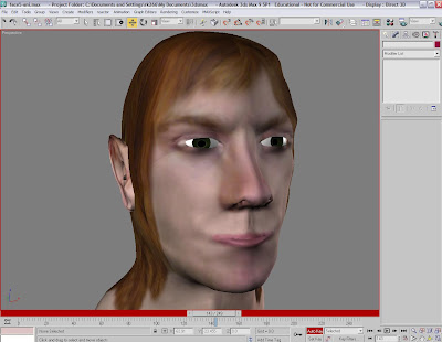
As you can see on that attempt I had weird issues with symmetry on the texture and it generally looks quite poor. Below is my second attempt.


This time I was much happier with the result of the texture, it came out without any problems and it looks much better. Now from here I can start adding more detail and making the face more realistic still.

Monday, 12 October 2009

UVW Mapping Part II

To carry on where I left off earlier, the next step is the ear. Under the materials menu I turned off the chequered texture to see the head properly again. I selected faces inside the unwrap UVW sub selection and began painting the polygons that make up the ear. Any polygons that were selected by mistake can easily be unselected by Alt clicking.
I switched to the left hand view port, where I can see the ear more clearly and then on the right hand side under Map Parameters I chose 'Pelt' and aligned it to fit around the ear.


Below that there is an option called 'Point to Point Seam' where I clicked a point on the ear closed to the side of the head then clicked a point nearest the outside the lobe of the ear. A blue trace line is then generated.
Now I have to edit the pelt map, this is done by bring up the edit pelt map screen, very similar to the edit UVW map screen I used earlier for the face and head.
Around the ear a lot of red and blue lines all connected to each other, come out from the ear. This shows the directions in which the pelt map will pull the texture coordinates.


I used the scale tool to pull the lines out more so there's more room to see what's going on. I also rotated it so the lines are pulling in the right direction. Then on the dialogue box I clicked 'simulate pelt pulling' to see how the lines pull the object. I closed this screen now that the pelt pulling is done. Back on the normal view ports, with the chequered texture back on I can see how the pelt pulling has affected the texturing on the ear.


Now back inside the UVW map edit box, under map parameters, using the free form tool to select the ear and scale it right the way down so it can fit inside the chequered box by the map of the face and head.


I didn't put the ear over the side of the head because this would cause problems with overlapping points and such, besides the ear doesn't have to be in the exact location, putting it underneath the head and to the side is fine.

Next I closed the edit screen and back on the modifier panel I clicked the symmetry modifier which is the top most modifier applied. I then applied a second unwrap UVW modifier to the model. This means I can now modify both parts of the face within the edit UVW map parameters.
So back inside the edit screen again, with 'face mode' and 'select element' applied I then clicked on the face map until I selected the other side of the face, I could see which side was being selected within the view ports next to the edit menu. With the other side now selected, I clicked the mirror option at the top to copy and mirror the face map, I moved it across and lined it up so it makes a full face and head map.


I did this also with the ear. The ear was more tricky to select, the best way is to make sure your in face selection mode and just keep clicking until you see the opposite ear light up in red.


The next stage was to weld the left and the right hand side face maps together forming one big map. I did this by bringing the two maps together as close as possible without overlapping one another and then from the bottom of the chin up to the bottom of the mouth, bring the points together and welding them. Then from the top of the mouth right up past the nose and up to the forehead, welding the points together there as well.


Once that was done I changed the aspect ratio of the map. Under the options width and height I changed the width to 512 pixels, by 256 pixels in height. Giving the map a 2:1 aspect ratio.
Then I resized the map to fit it back inside the chequered box using the free form tool.


To render out the UVWMap template I had to go to 'Tools' at the top of the 'Edit UVWs' screen and go down to 'Render UVW Template'. This brings up a dialogue box with render settings such as aspect ratios, colour fills and visible or invisible edges.
As I changed my width and height ratios under the bitmap size options to a 2:1 aspect ratio I had to reflect this in the 'Render Uvs' aspect ratio setting. I changed it to width 2048 by height 1024.


Also by turning off 'Seam Edges' I can render out a clean white on back image.


When rendering out the UV maps of the face, you can see where mistakes with the topology have happening. The topology I did of my face was generally working as I had hoped and wasn't causing any issues aside from a couple mistakes at the side of the forehead area.
The obvious flaws within my topology were on the ear, where I had a numerous overlapping and inverted polygons. This was something I was not satisfied with, however the complex and organic shape of the ear meant that this was a problem that was going to be hard to avoid.


UVW Mapping Part I

With the head, neck and face modeled I now had to concentrate on bringing it to life with texture.
I deleted the 'Smooth' and 'Turbosmooth' modifiers from my object so I only had my editable poly object and the symmetry modifier. I applied a unwrap UVW modifier under the symmetry modifier.
Within the unwrap UVW modifier sub object selection I chose 'Face' so I can select polygons on my object. I unchecked 'Ignore Backfacing' and changed the marquee mode to paint. I painted the whole right side of my head and face apart from the ear, which will be handled separately.


Under the map parameters I selected Cylindrical and chose 'Align Y' to align the gizmo the right way up. Then scaled the gizmo to fit the whole head in, after that I moved the gizmo over to the right slightly so it was roughly in the middle. The reason for making sure its in the middle is because a green line will follow the outline of the object and if the gizmo isn't centred additional green lines creep up in other parts of the face which will cause problems.


Now clicking off Cylindrical mode to hide the gizmo, I then opened the material editor and set up a chequered pattern to apply as a texture to my object. The idea is to try and get each of the squares on the texture to be square and not stretched. I set the tiling to 35 points each to get small accurate squares on my chequered texture.


On the right hand side, under parameters I clicked 'Edit' to bring up the edit uvw map box.
I clicked face mode and select element under the selection mode options, then I clicked on the map of my face to select it. I clicked another option called 'Filter Selected Faces' which will hide everything that isnt selected, such as the ear. Under 'Options' at the bottom I turned tile bitmap off and turned constant update on. This means whatever I do on the edit uvw screen is done on the actual object in real time.


The next thing I had to do was fix any inverted and overlapping points on my object. I scaled and moved the map so it fit within the chequered box background. Then I selected the points at the top of the head and used the 'Relax Tool' under Tools. When the dialogue box appears the default options are all fine, so I clicked apply to then relax the points I selected. This smooths out any overlapping or inverted points.


After spending time using the relax tool on the head and face areas to smooth out a lot of the polygons, I selected the points which make up the eye area and used the relax tool again. This time on the dialogue box I changed 'Relax by Edge Angles' to 'Relax by Centres', this relaxes the points in slightly different way which is much better for doing circular areas such as the eye and nose which can be particularly difficult because of the overlapping points.
I also went over and made sure any polygons that were looking too much like triangles were tweaked back into a quad shape. This helps when applying the textures later on.


The next step is to apply the same methods to the ear, then render out the face map to import into Photoshop.